Navi+ Case studies
Below are some case studies (from clients currently using Navi+) that have improved the navigation quality of their websites on Shopify. Click on the images to experience it yourself, or scan the QR code on your phone to try it out. Wishing you success!


Chocoladna.com

Scan QR to test on your mobile
This website creatively utilizes Navi+ by moving the entire product catalog to the bottom bar, significantly enhancing customer navigation. Customers can effortlessly scan, select products, and browse categories with intuitive, professional visuals and easy interaction, even with just one hand.
You can see how the use of colors seamlessly aligns with the website's theme. The menu load speed is incredibly impressive, almost instantaneous.
You can see that the navigation provided by Navi+ offers an indispensable solution for customers visiting this website. You can definitely apply this idea to your own website.
Deeply appreciated.


Ewsells.store
Scan QR to test on your mobile
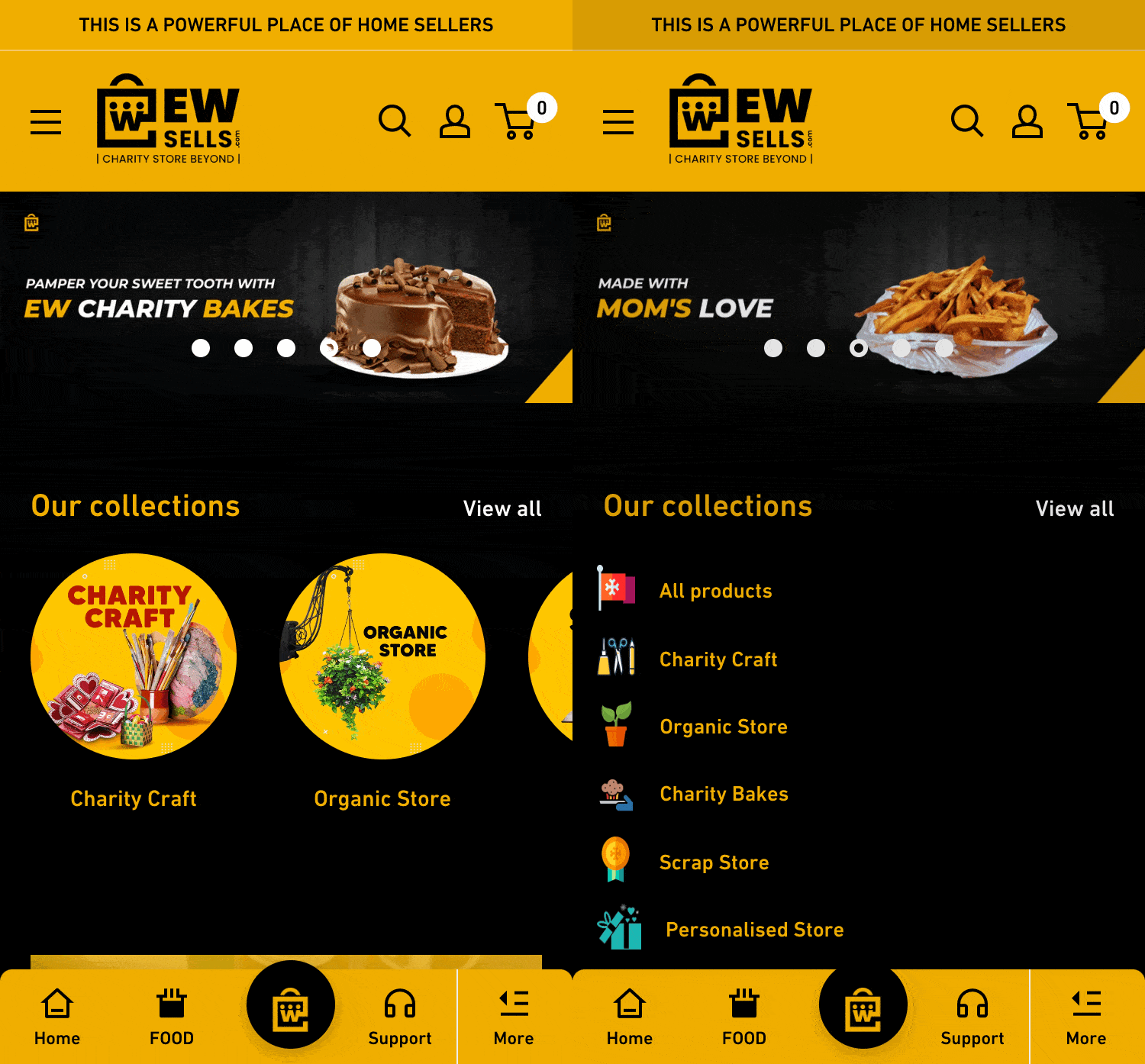
This is a household goods website that uses a very distinctive yellow and black color scheme. The website has used Navi+ to create a tab bar with a yellow tone and black icons and text, harmonizing with the website's overall color theme. All the main navigation elements are placed at the bottom, close to the user’s fingers, making interaction more convenient.
The website still uses a hamburger menu for other menus, but as you may experience, using a hamburger menu can be challenging due to its length. The menu is overly long with multi-layered categories and too many support pages, which is a problem that Navi+ helps solve, as you can see in this example.


Reloadpaddle.com
Scan QR to test on your mobile
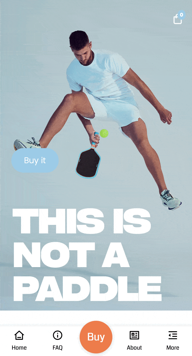
This is a proof of Navi+'s ability to cater to the unlimited creativity of websites. Personally, I am particularly fond of this website. Instead of creating too many pages and constant page transitions, the number of pages on this website is quite limited. Navi+ serves as a 'screen slider,' helping users navigate to the content they need. This helps the website maintain a minimalist design and easy navigation.
Navi+ supports many smooth scrolling features, allowing you to do similar actions: scrolling up, down, and to a specific point on the page. Navi+ also provides many other types of navigation: linking to a URL, sliding hamburger menus, search boxes or cart boxes, opening chat windows, and sharing.


Mycoroshop.com
Scan QR to test on your mobile
At the time the website was selected as a case study, they were using the Starter plan. By using text and icons smartly, the website transformed a normal, simple mobile interface into a very professional one, with links to product groups, cart, order tracking, and support pages. The fonts, colors, and icons are truly harmonious and fully integrated with the website's interface.
Did you know that with just the Starter plan, you can design a wide variety of Navi+ menu interfaces? With a list of icons in both outline and solid styles, Google Fonts' Unicode fonts, and configurations for colors, scaling, spacing, etc., you are free to be creative.


H2oglow.dk
Scan QR to test on your mobile
Using a type of menu with a purple-highlighted menu item in the center, from a pre-built template in Navi+ combined with animations, all readily available in Navi+, this website has created one of the most minimalistic yet beautiful, professional, and user-friendly websites.
You can refer to how the fonts are harmoniously used and how the outline icon style perfectly matches the website’s design, along with thin imagery and fonts, which have been a design trend in recent years.


Heaterhk.net
Scan QR to test on your mobile
This is one of the first websites to use Navi+ and has contributed many valuable ideas to Navi+. You can see that sometimes the Bottom Bar is not always the best choice for every website; here we have a Top Bar. One of the reasons for this decision is that the floating chat button and Google reviews are positioned at the bottom, close to the user’s fingers. In this case, Navi+ functions as a large header menu, pinned to the top edge of the screen when scrolling down.
Take note of the subtle use of colors in the menu background and icons, with a slight opacity that makes the website more visually appealing and sophisticated.
Thank you Heaterhk.net for the way you’ve utilized Navi+


Mora1.com

Scan QR to test on your mobile
Surpassing conventional thoughts on familiar design with LTR text reading and Latin fonts, this website is a testament to how Navi+ can adapt to different languages and cultures around the world. It is a beautifully designed website, rich in design language and professional in its presentation.
Here, Navi+ is used as a Bottom Bar menu with RTL text reading, containing all the main navigations of the website. Navi+ is also used in a Top Bar as a simple filter.
This can certainly be considered a source of pride for Navi+.


Soulharborstudios.com
Scan QR to test on your mobile
The owner of this website is truly an artist, and in fact, his creativity is remarkable. Using Shopify's default (and free) Dawn theme with Navi+ as the central navigation to guide the entire user experience, he has turned the website into a real experiential space.
Notice how he uses a large, green image at the center of the website with two lines of rotating text around it. It’s a creative and unique design—users’ eyes and navigation are drawn to that green circle, from which they are guided through the site.
You can directly experience this website by scanning the QR code above or clicking on https://soulharborstudios.com.