Runs perfectly on both mobile and desktop, but is most effective for “Mobile-first”.
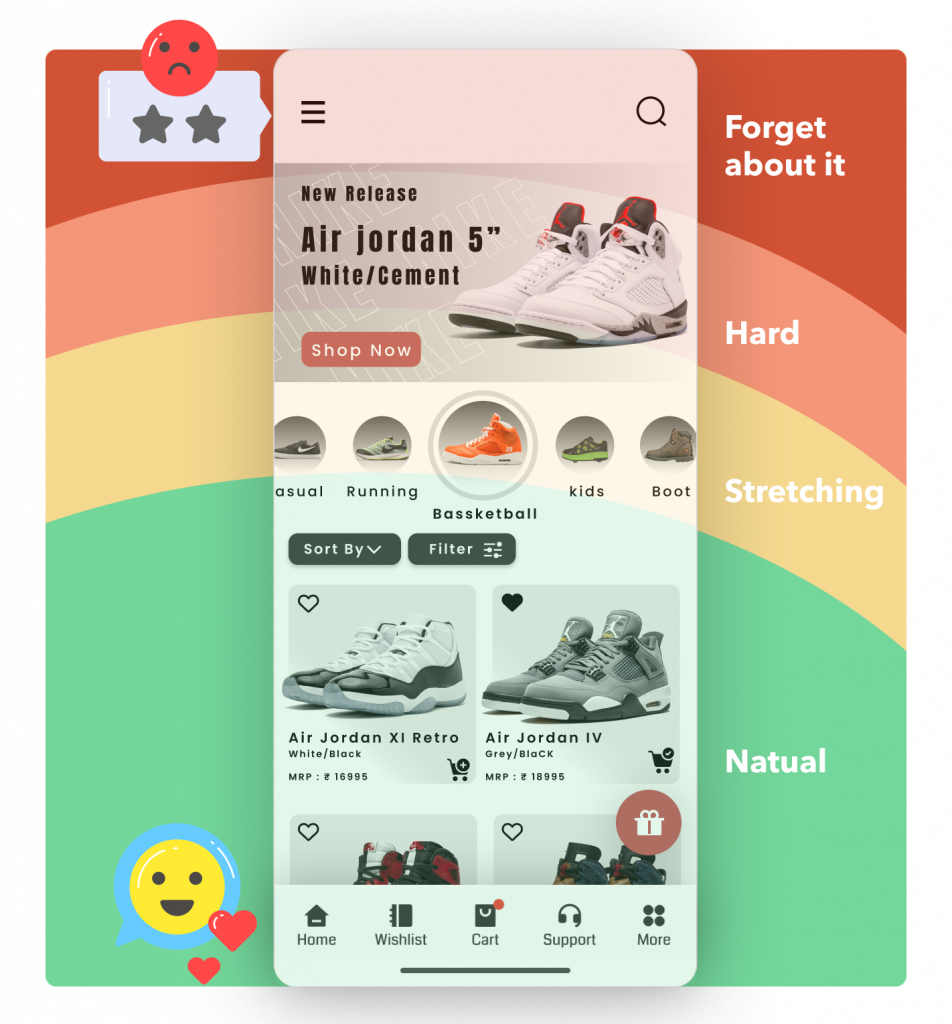
Currently, mobile devices account for 80% of user bandwidth usage, yet most website designs only stop at ‘Mobile friendly’ but are still ‘Desktop first.’ Pronavi will help you redesign your website with a truly “Mobile-first” approach.
GREAT DEAL
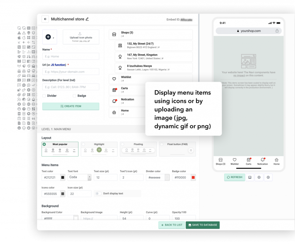
Extremely flexible, diverse, and limitless
You can create an unlimited number of components to be attached to various pages, separately for mobile or desktop, easily manage multiple layers of content, choose styles, positions, colors, icons, or upload images, fonts… as you wish.
GREAT DEAL
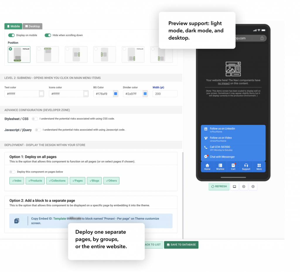
Run extremely lightweight, continuously optimized, and conflict-free
The components always run very smoothly with caching technologies, file compression, CDNs, etc., ensuring no impact on the website’s speed and no conflicts with any other themes or apps.
GREAT DEAL
Daily measurement, user understanding, and easy A/B testing
There are tools available to assess the effectiveness of each navigation through daily analysis, making navigation optimization easier. It also facilitates efficient testing of wording, images, placement, and serves A/B testing optimization